Better School Choice
Case Study
Flatiron School 2025

Overview
Better School Choice is a tool that helps parents find the right school for their child. The goal of this project was to simplify the overwhelming school selection process and improve on the shortcomings of existing products. Designed for parents of K–12 students, the platform empowers families to make confident, informed decisions about one of the most important choices for their child’s future.
My Role
My role was to lead the project through both research and design. This included reviewing interview transcripts with parents who had just undergone this process, analyzing the main competitors, and designing a product that solves the problems I found.
The Problem
Parents face significant hardships when deciding on the right school for their children. They are often overwhelmed by the number of options, uncertain if a school can meet their child’s specific needs until visiting in person, and frustrated by making trips only to discover their needs could not be met. These challenges create both financial and developmental risks if the wrong school is chosen. Parents need a solution that streamlines this process and matches them with schools that meet all of their exact needs—before they even step out of the house.
User Research
The goals of this research was to determine what works, what doesn't, and what needs to be improved upon. My research started by reading 6 interview transcripts provided by Flatiron where parents detailed their experiences selecting the right school for their child. My findings indicated that parents were overwhelmed when it came to the number of options they had. Parents generally had no way of knowing if the specific needs of their children could be met until they physically visited the school. Or they would make the trip only to discover one or two needs were met but left out another crucial need. Parents are understandably worried that they could commit their child to a school that will not foster the best growth possible. Making a mistake in this process won't only cost them financially, but could set the education of their child back as well.
Competitive Analysis
Next I took a look at the top competitors in the field. Niche and GreatSchools were the two that seemed to dominate the space. First I looked at Niche, A tool providing in-depth user profiles, user reviews, and data driven rankings. Next GreatSchools, a tool with a focus on academic performance and equity, using test scores and government data.
My Findings:
Niche: in-depth user profiles, strong reviews, and data-driven rankings.
GreatSchools: focuses on academic performance and equity using test scores and government data.
While Niche was the strongest, all products shared a common flaw: cluttered, overstimulating designs. This highlighted the need for a simpler, more focused solution.
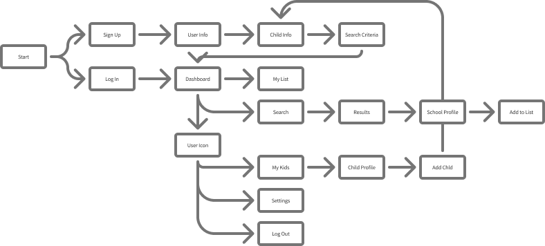
Design
To start, I determined what screens would be essential to the product and would build on that foundation. I drew 8 iterations for each screen to brainstorm the best possible layout for each along with a flow chart.


From here I designed the first low-fidelity prototype. I came up with this tab system where you could seamlessly swap between each child profile while applying the search criteria unique to each child.

After the functional designs had been solidified I moved onto aesthetic design. I carefully selected the typography, color palette, iconography, and visual style the final product would have. Keeping accessibility in mind, I wanted a warm, fun, and functional color palette that would give the product a memorable identity.

Usability Testing
I ran usability tests with four people. Two new parents and two experienced parents. The product was appealing to both groups and both groups were happy with their first impressions. The Users were tasked with signing up and adding a school to their list as well as adding another child to their profile. Both groups were able to complete the task but following different flows with one group taking a bit longer. I made it a point to streamline the process even further and make the intended flow even more clear for the next iteration.
Impact & Outcome
The final high-fidelity prototype greatly improved the shortcomings of the first prototype. I added a screen to apply search criteria to the initial setup of the child profile so Users would be ready to go immediately after setup with personalized recommendations. With the tab system I designed parents now have the option to quickly be matched with schools that fit the exact needs of their children.


I set out to simplify a stressful, high-stakes process into a clear, guided experience that empowers parents to make informed, confident decisions. At the end of this project I ended up with a polished, user-tested design ready for real-world implementation.