Miller’s Cycology
Case Study
Product Design, Web Design, Branding, Print
Freelance 2026
The Task
I was tasked with creating branding for an expanding bicycle company in the KC area. This included color palette, type, logo, business cards, and a website the client would be able to update as the business grew.
The Problem
The client had been getting business from word of mouth and bike meetups up until this point and felt they had hit a plateau.
The Solution
The solution was to help create a recognizable and professional looking brand for the client to help reach new potential customers.
Logo
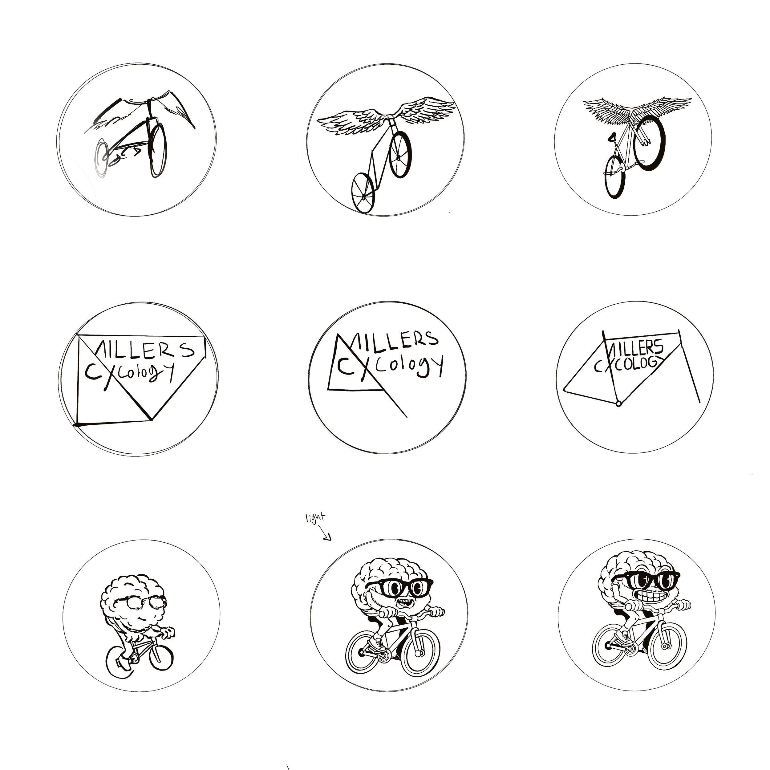
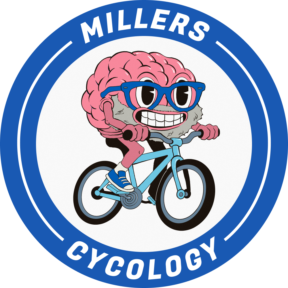
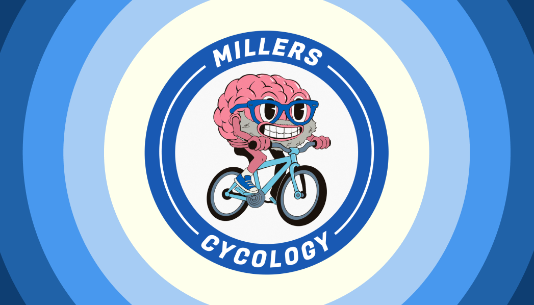
The logo saw a few iterations before landing on the brain on the bike. The client wanted to emphasize the psychological benefits of cycling as part of the logo. They also requested for it to be hand drawn (my favorite!). This was a pleasure to come up with.
Type & Palette
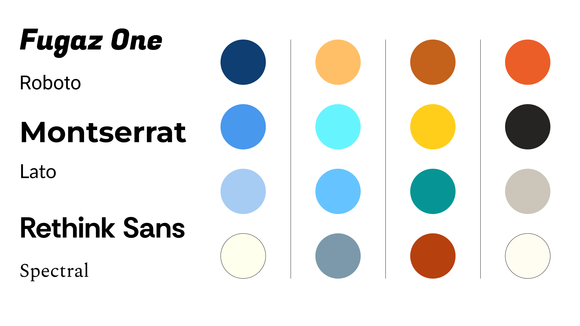
I gave the client 3 type pairings and 4 color palettes to choose from.
The Client went with Fugaz One and Roboto and chose the first color palette to the left.
Flowchart & Competitive Analysis
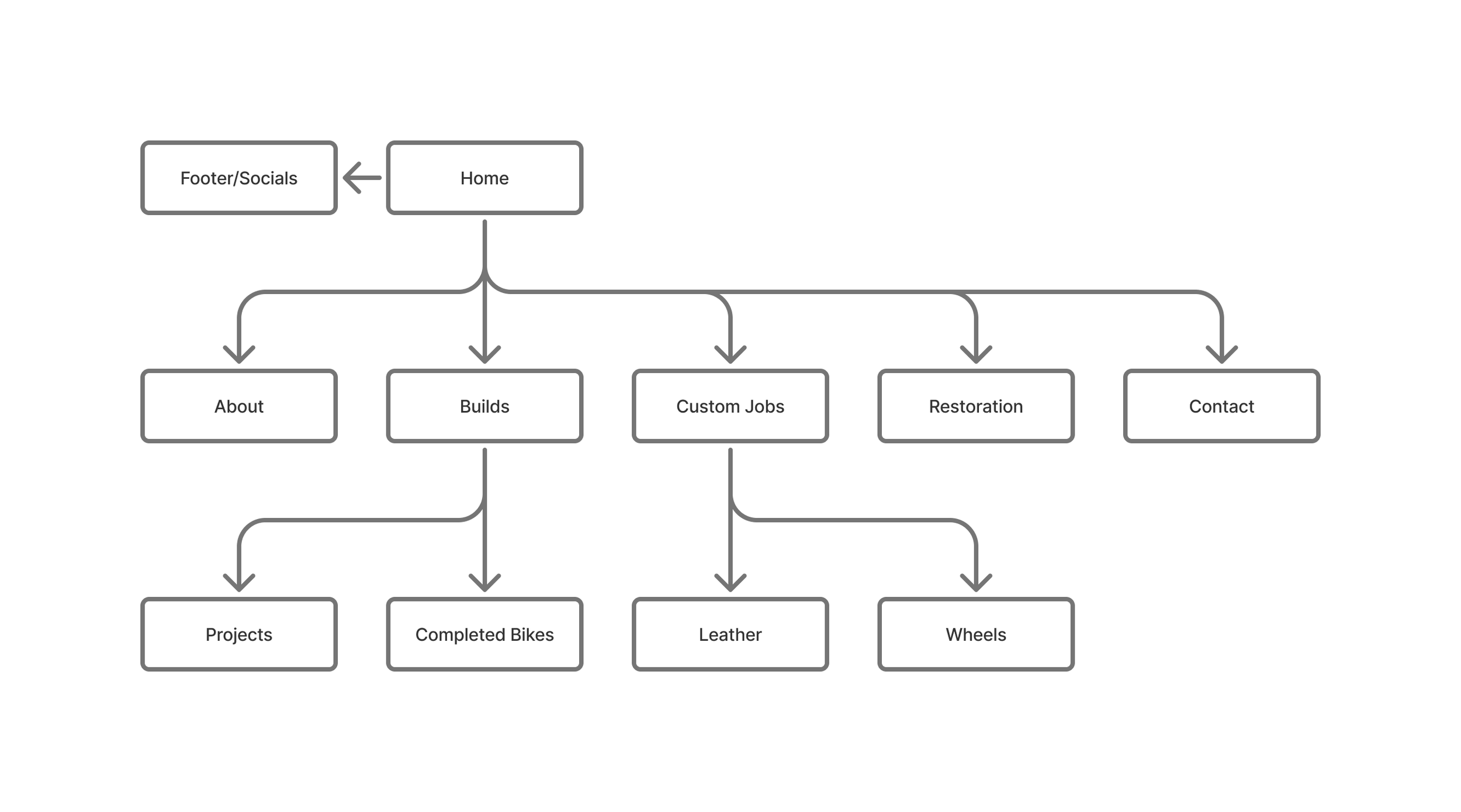
Next I asked the client to identify what pages were most important to him and got to work mapping how the site would flow. Before doing this I looked at competing businesses in the area. Most had outdated and difficult to follow websites with a messy information higharchy. With this I strove to keep the website as minimal and easy to follow as possible, only adding what was necessary to convey what the business was all about.
Business Cards
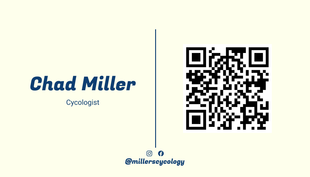
The Client wanted simple business cards with a qr code for quick access to the website.
Website
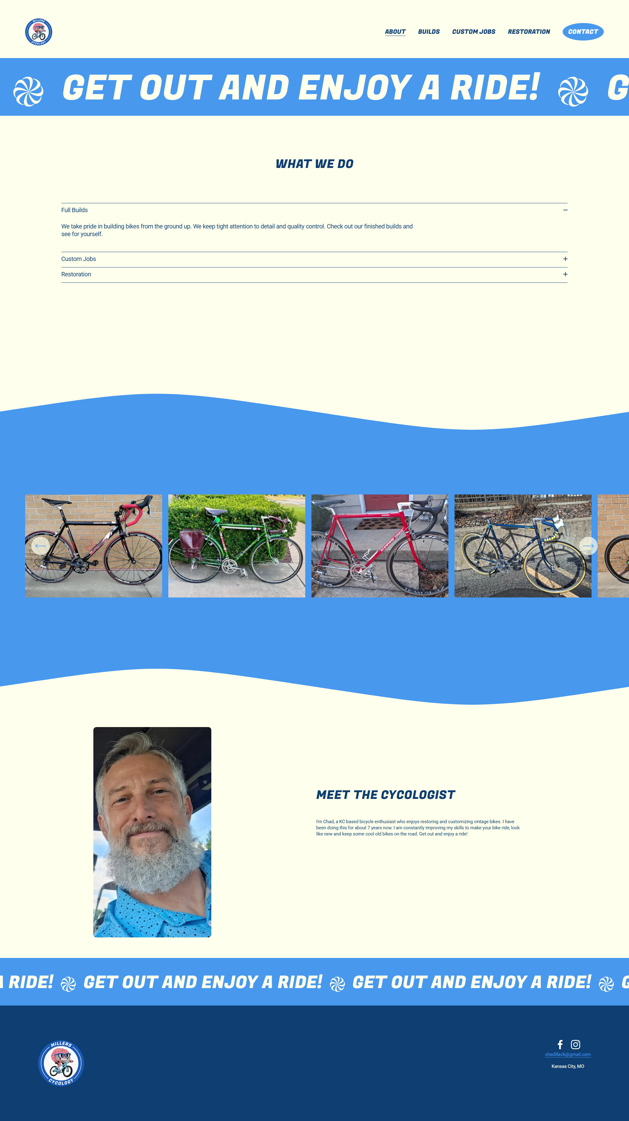
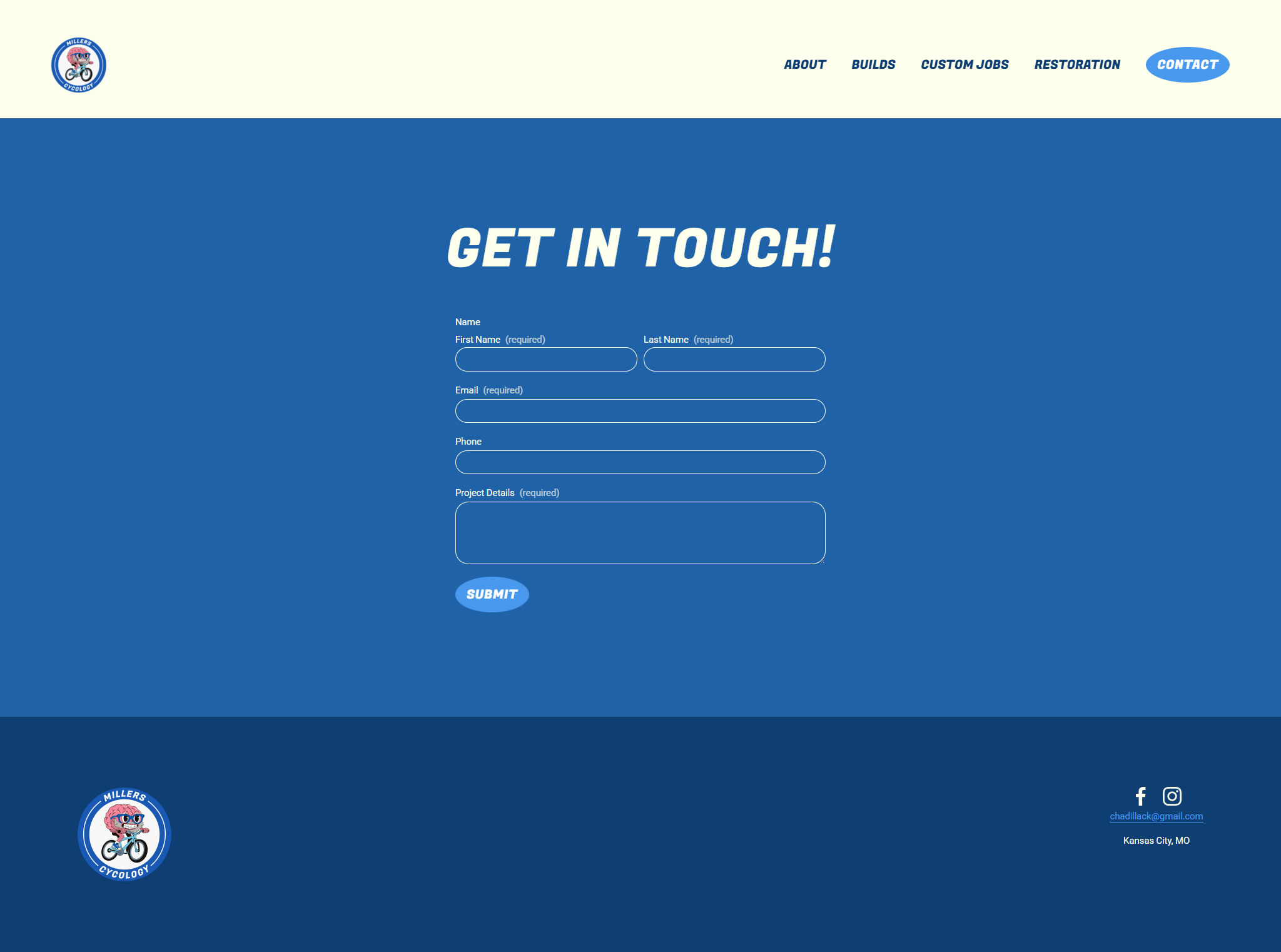
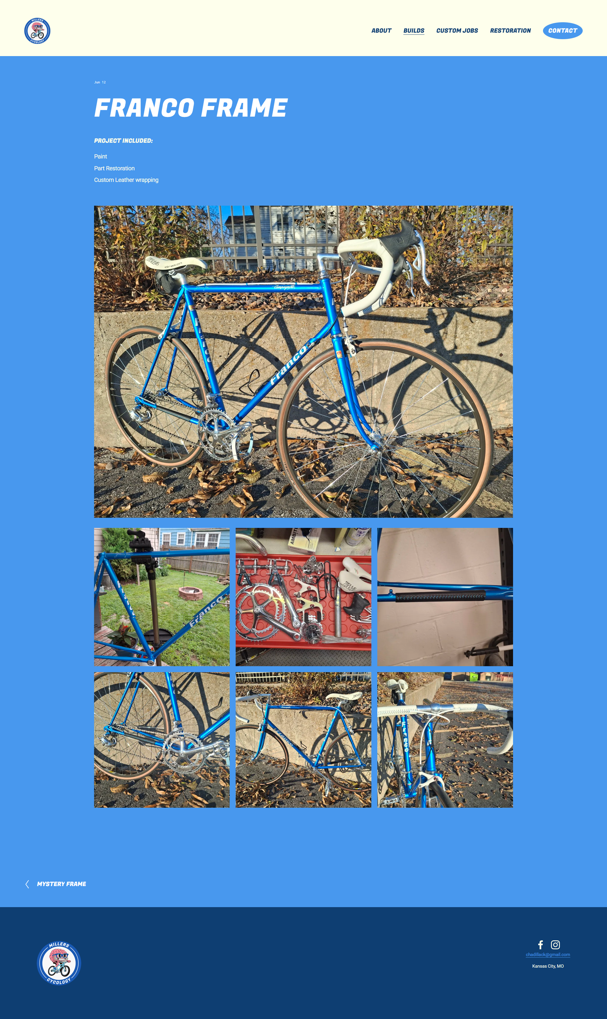
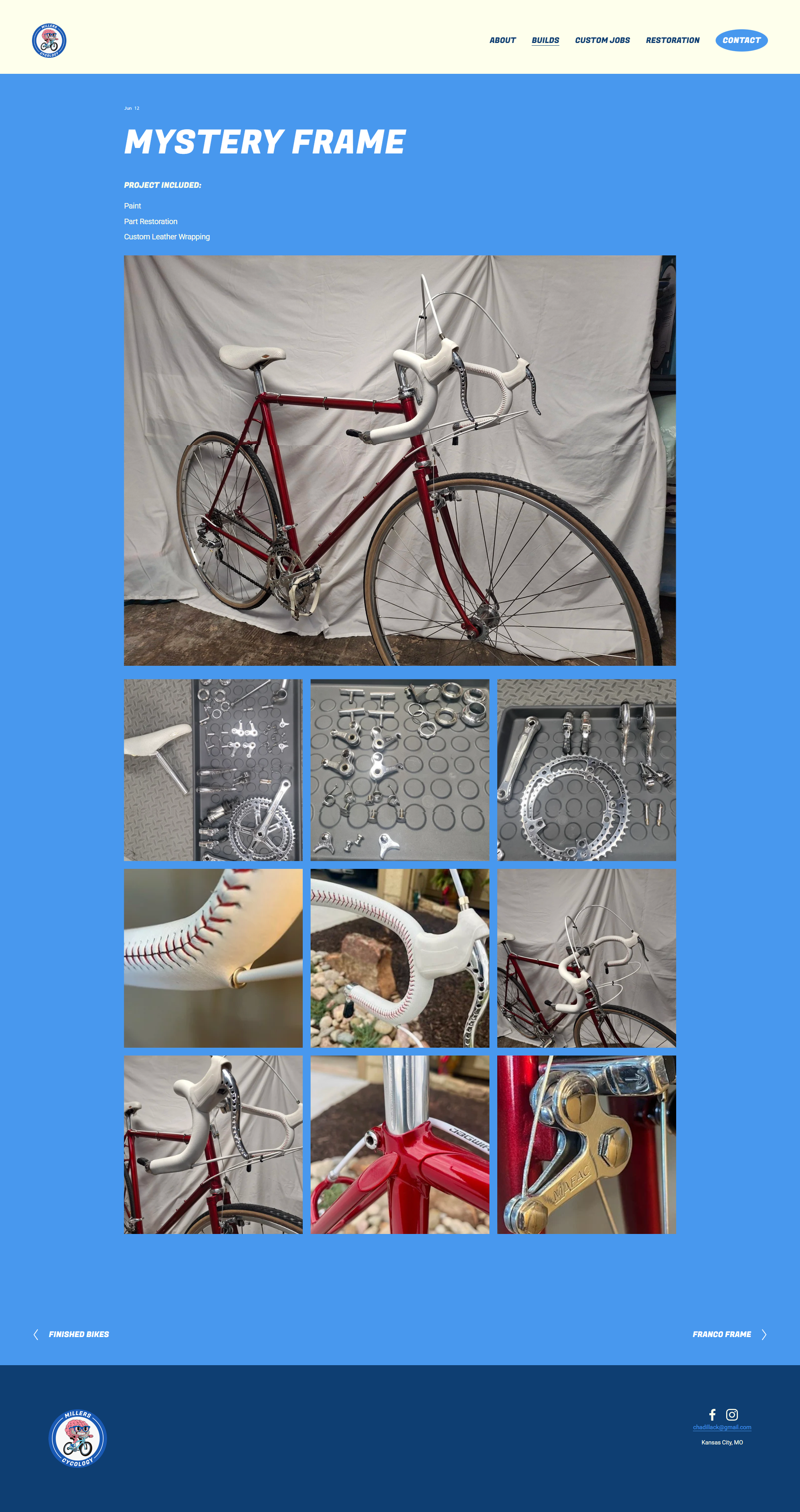
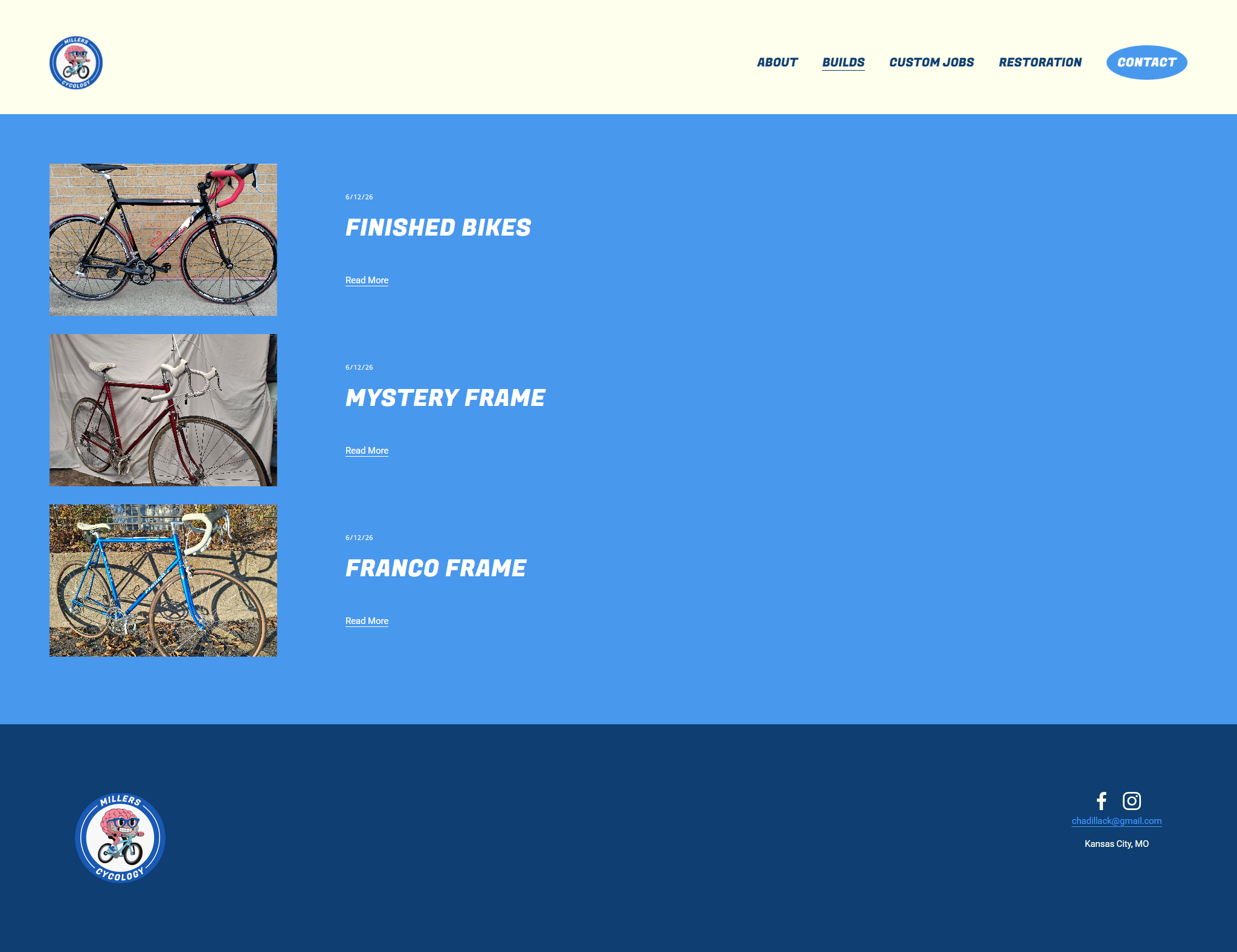
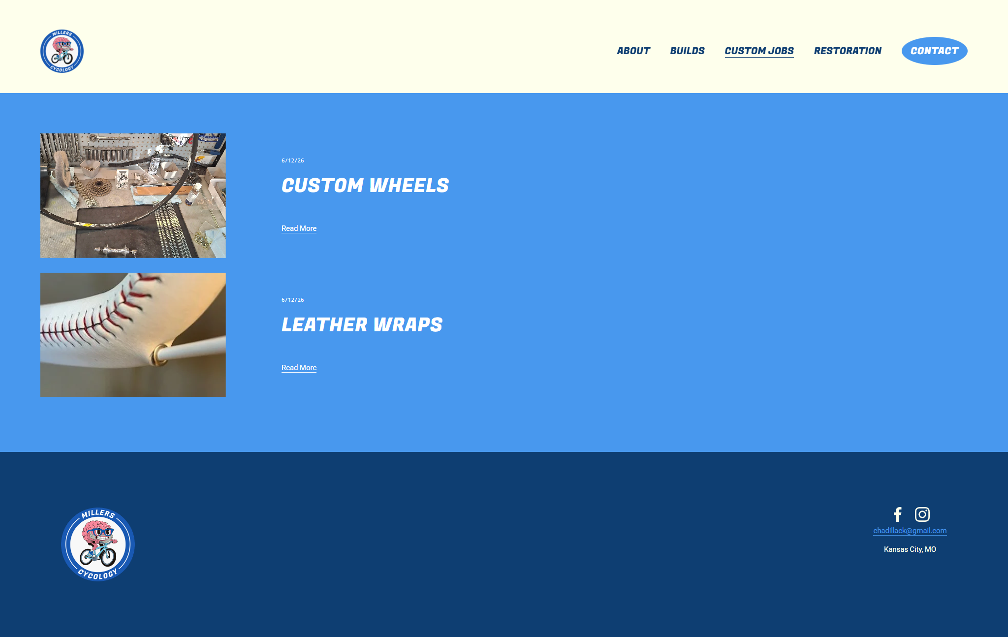
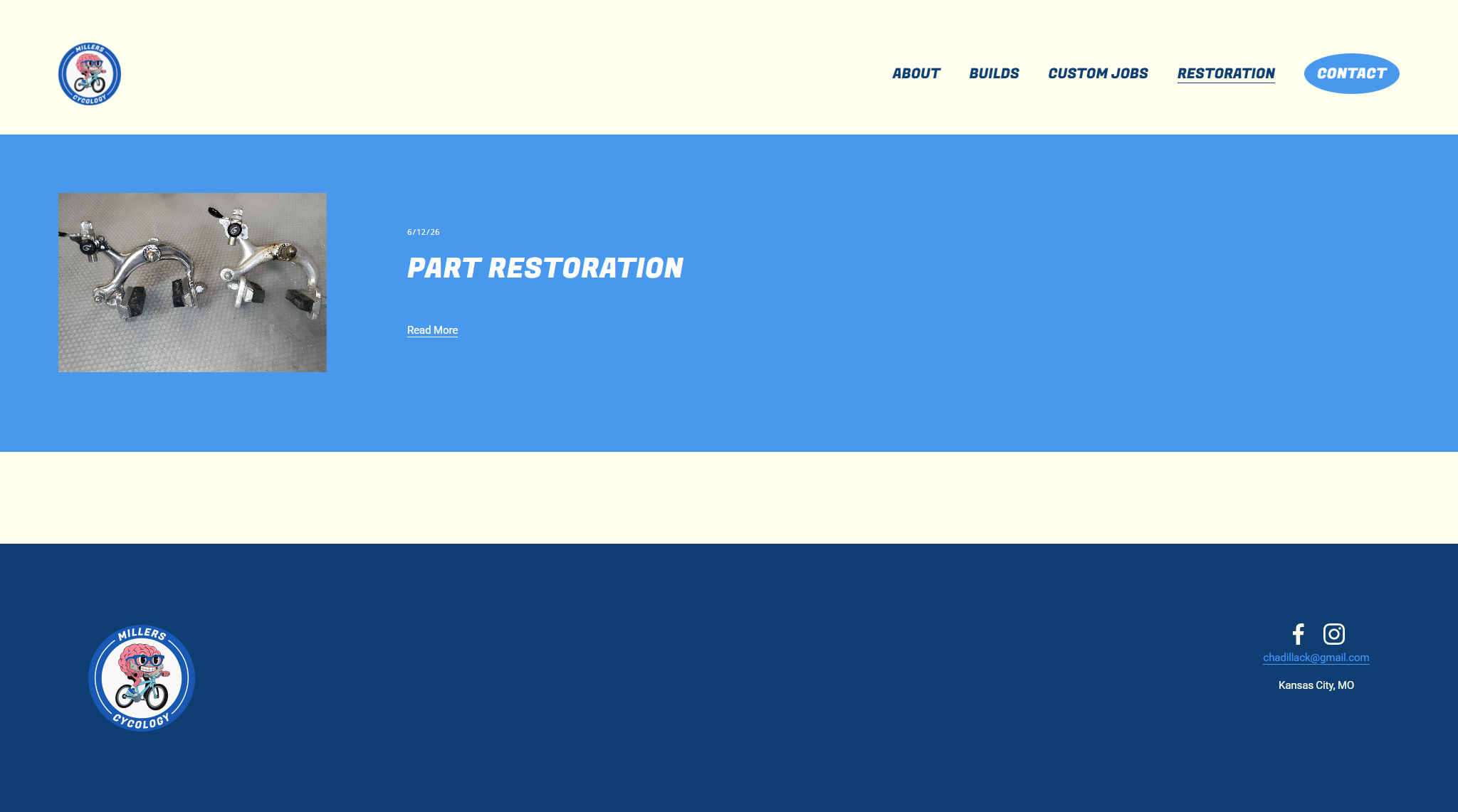
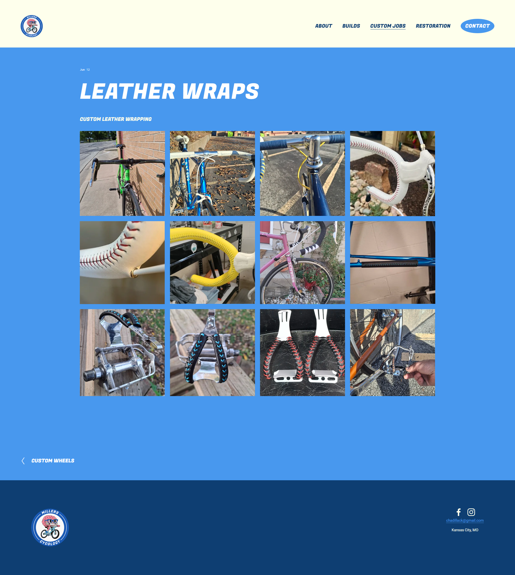
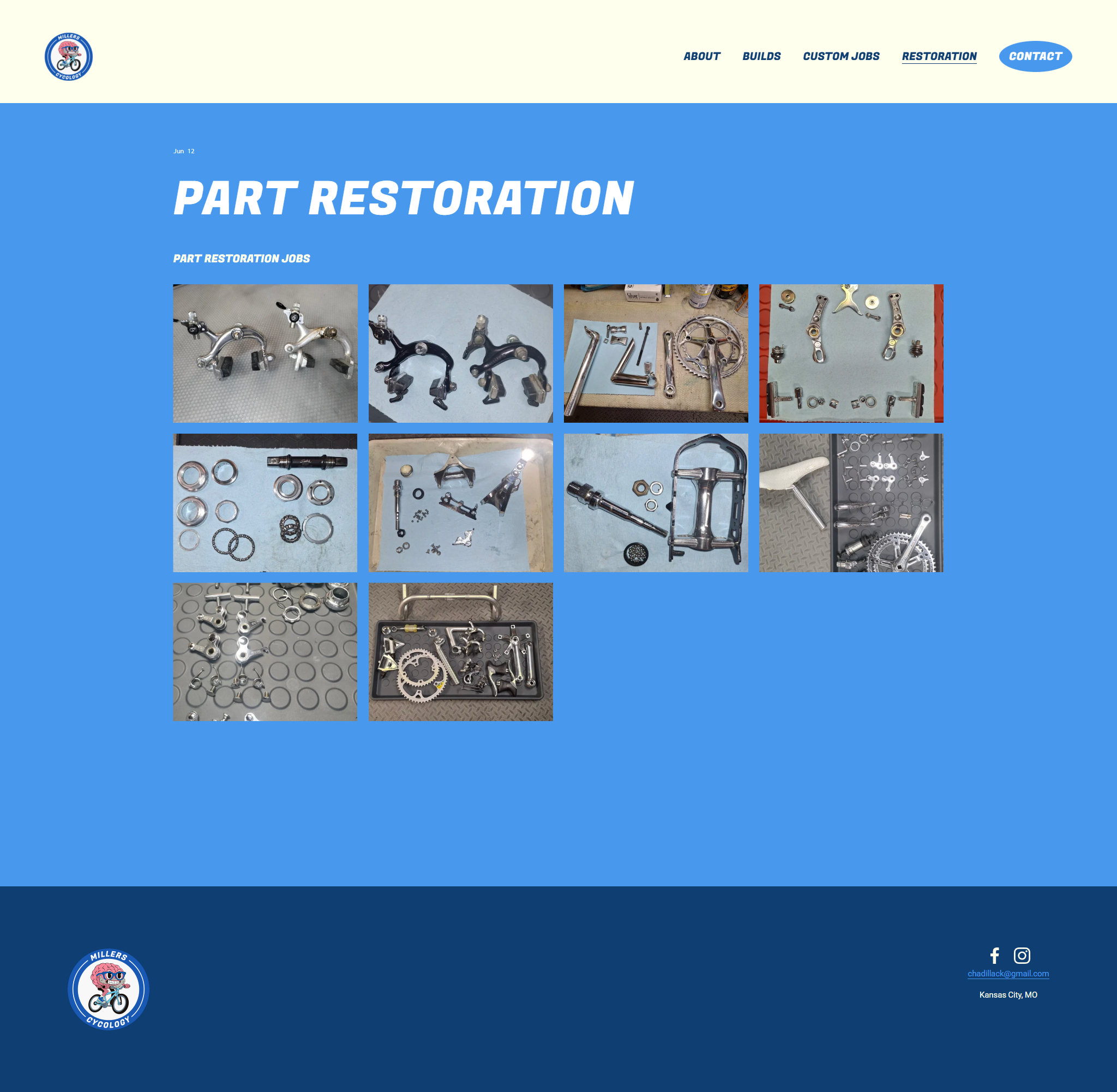
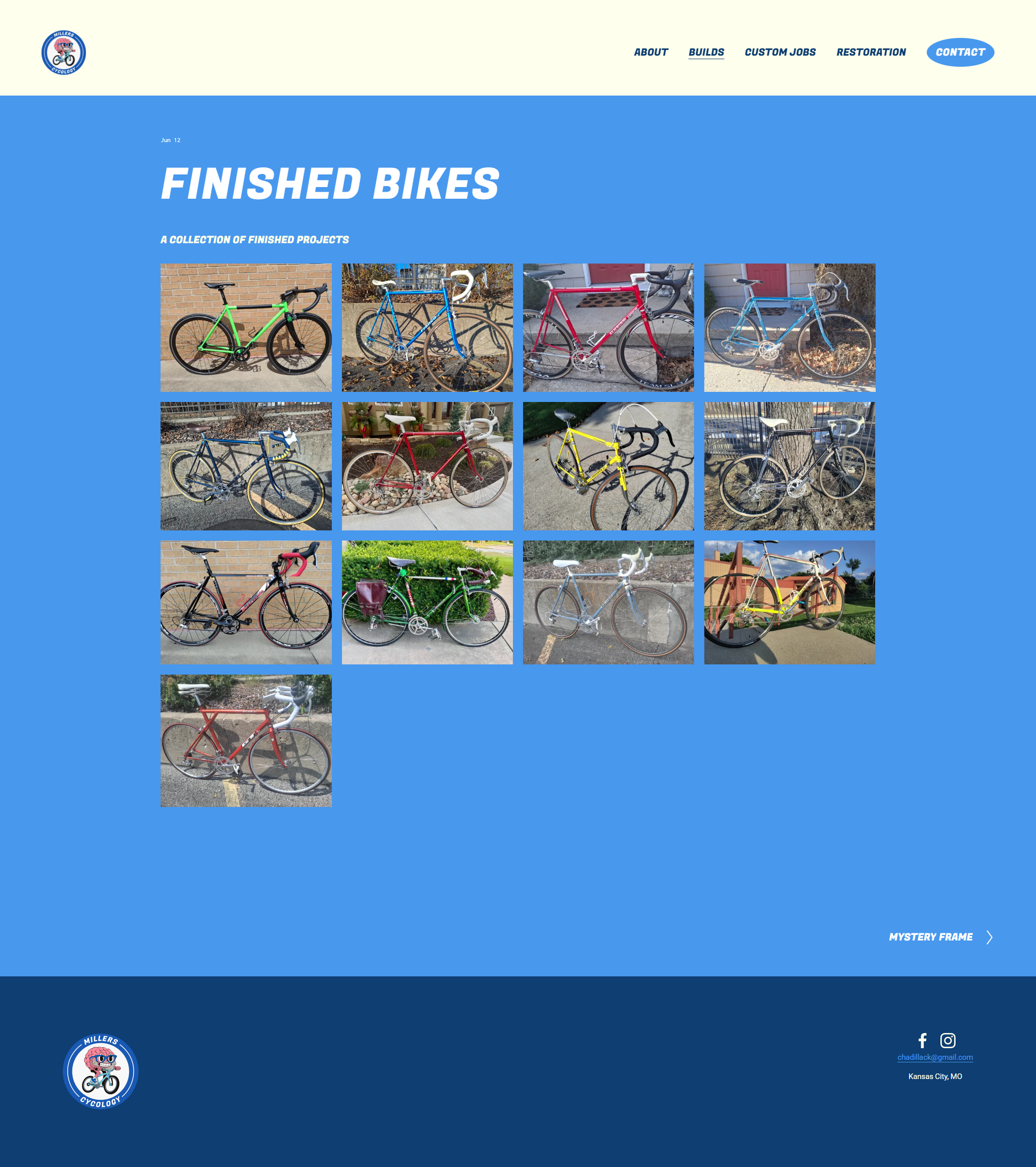
One of the most important elements of this project was for the client to be able to make edits as the business grew. We decided on having the website built in Squarespace so they could navigate edits on their own after I had set the initial site up.
Conclusion
Miller’s Cycology now has a fresh face and an intuitive, satisfying digital experience. I felt it was important to capture the essence of a trustworthy local business when I designed the logo and palette. The website is easy to navigate, accessible, and visually engaging. Customers now have a streamlined and memorable experience where they can see the businesses finished work and make inquiries for future jobs. Both the client and I are happy with the outcome and I look forward to seeing what Miller’s Cycology does next.
